- BOOK COVER DESIGN -
Hello Artist!!!
Today is step 4 of this project - writing and illustrating a short story. I am very proud of all your hard work!!! Keep it up!
Today is all about the book cover. What is needed on a good book cover and why is it needed?
1. Title - This is important as it sums up the theme of your story and tries to hook your reader in by the cover alone. Subtitles can also be added to elaborate or distinguish one book in a series from others. You will likely not have a need for a subtitle as this is only 1 of 1, not 1 of 7 for instance (Harry Potter Reference).
2. Author and Illustrator - This is important for your readers because if they love your book and want to find more that would be similarly written, then they will need to know the author to make their search. Also, it is industry standard to have your name on the front cover of your work as the artist who deserves the credit. If you are in a group, then all of your names will be on the cover.
3. Cover Art - This is your opportunity to foreshadow (give a preview) of an event or theme explored in your story. I recommend drawing an image of the most intense event in your story to captivate your viewer and draw them into the story. However, sometimes the art is forgone (left out) intentionally so the viewer only sees words. If you don't have art on your cover, then what words you do have should be masterfully produced so that your cover looks professional. Don't think of this as an easy way out, a book cover without an image will be judged more harshly and critically than one with an image.
You will be designing your final cover on Gimp and saving it as a PDF file like all the other pages in your book. If you have original art that will be used as the art for your cover, then you will need to scan or photograph it and import it as your have already done for your interior book illustrations. You will be using the text box tool to add your text/writing/content for the cover. This includes the Title, subtitle, author and illustrator info, etc. You can experiment with varying fonts, font sizes, spacing, colors, and even make it look 3D by adding drop shadows.
You may experiment with fonts, but your font should definitely be legible (readable). You can download new fonts into your Font Book (for Macs) if you're looking for something specific (like handwriting, calligraphy, block text, etc.) from websites like dafont.com.
To accomplish this correctly, you must choose a font (after previewing what your title would look like in that font), download it, open Font Book app in your applications, and drag your new .otf or .ttf file (font file) into your Font Book. Once you've done this, you can use this font in any application on your MacBook. Its really cool! ***note this will not allow you to change the font in a google document as the fonts on google docs don't come from your hard drive, rather from the software online.***
Ok so now that you've read about the cover, I want to show you a number of examples from a few different categories; such as, Black and white cover design, 3D cover design, monochromatic cover design, complimentary color scheme cover design, and classic Children's book examples. You must slowly examine each one and pick an absolute favorite book cover that you would want yours to look like. You will drag the image onto your desktop and begin emulating it when you design your own book cover. Please keep your overall brand and style in mind and pick a book cover style that is well suited to your ongoing work to maintain a sense of unity. You may also search and find your own inspirational image if you don't like any of the following examples.
Ready? Here we go!...
- Black and white cover design -
These covers are built with high contrast in mind. This gives the book a competitive edge over other options in a book store because you can read them from far away. A book cover with color on color is harder to see and read from a distance. Pick this is you have a strong image idea that is relatively simple; such as, a silhouette of something or an interesting ink drawing.
- 3D Cover Design -
This 3D option is a strong choice when you want the image on your cover to come off the cover visually. This is a newer generation idea as it incorporates more stages of design than a traditional illustrated book cover. The extra work is well worth it however! The process requires you to design your cover, build it in layers, then set up the proper lighting for a photo shoot, photograph the cover, then import the image into gimp, edit it by adding the title or any other flat imagery, and then exporting the final document/image. Highly recommended as the extra work isn't really that difficult and the payoff is super impressive!!!
- Monochromatic (1 color) Cover Art Design -
This option is great when you want to have an emotional image that black and white can't offer as easily, but you also want to keep it simple. Monochromatic means using only one color. Black and white don't count however as they are not in the color wheel. So really you can use black, white, and one color, along with its varying tints and shades for variety.
- Complimentary Color Scheme Cover Design -
This complimentary color scheme option is when you choose two colors that are generally opposite from one another on the color wheel. Red and green are options, along with blue and orange, and yellow and purple. You can vary the specific color a bit to get eh perfect match up and it still counts. This option will give you a book cover that looks the most like a traditional work of art as it harkens back to Van Gogh's Starry Night, among countless others. Also, using a complimentary color scheme creates a strong contrast in energy where you have both warm and cool to represent different parts of the image. This is different than black and white as neither black nor white have a color temperature. Warm colors feel inviting and comforting in most cases, and cool colors can feel scary, lonely, distant, and cold depending on how the colors are used.
- Classic Children's Book Examples -
These examples are ways authors and illustrators have used principles from previously talked about designs and color schemes, and applied them to their own books. Here we see black line drawings over white, etchings, paintings, and digital art too!
Sooooo.... Now what will you do? I need you to choose an absolute favorite book cover. After you've selected one that is your favorite, consider which category it came from and begin to plan your own book cover based off of your favorite here. You will use your own title, replace its art with your own. But you can emulate the medium (drawing, photography, painting, etc) the color scheme, the fonts used, and overall styling. For instance, if your favorite book cover came from the 3D category, then you will need to build your book cover and then photograph it. You will use the photograph of the cover as your cover like they did. This will be accomplished in Gimp 2.1.
"Now get to work!!! Let your creative genius take flight! I'm extremely excited to see what you come up with!!!!" Sincerely, Mr. Lursen
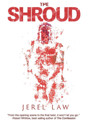
Here are a few of my published book cover designs for examples of how I have made book covers for customers:

